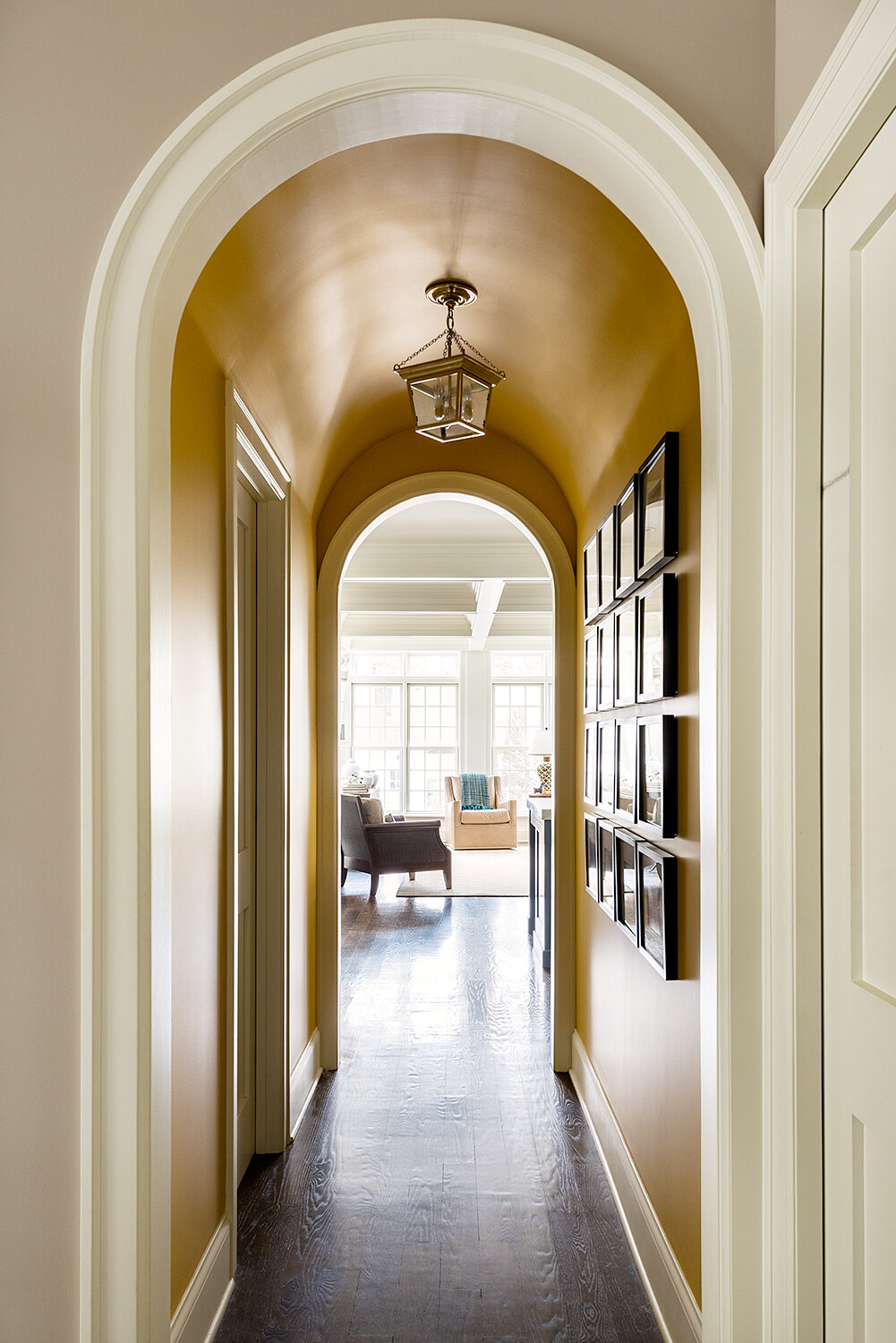
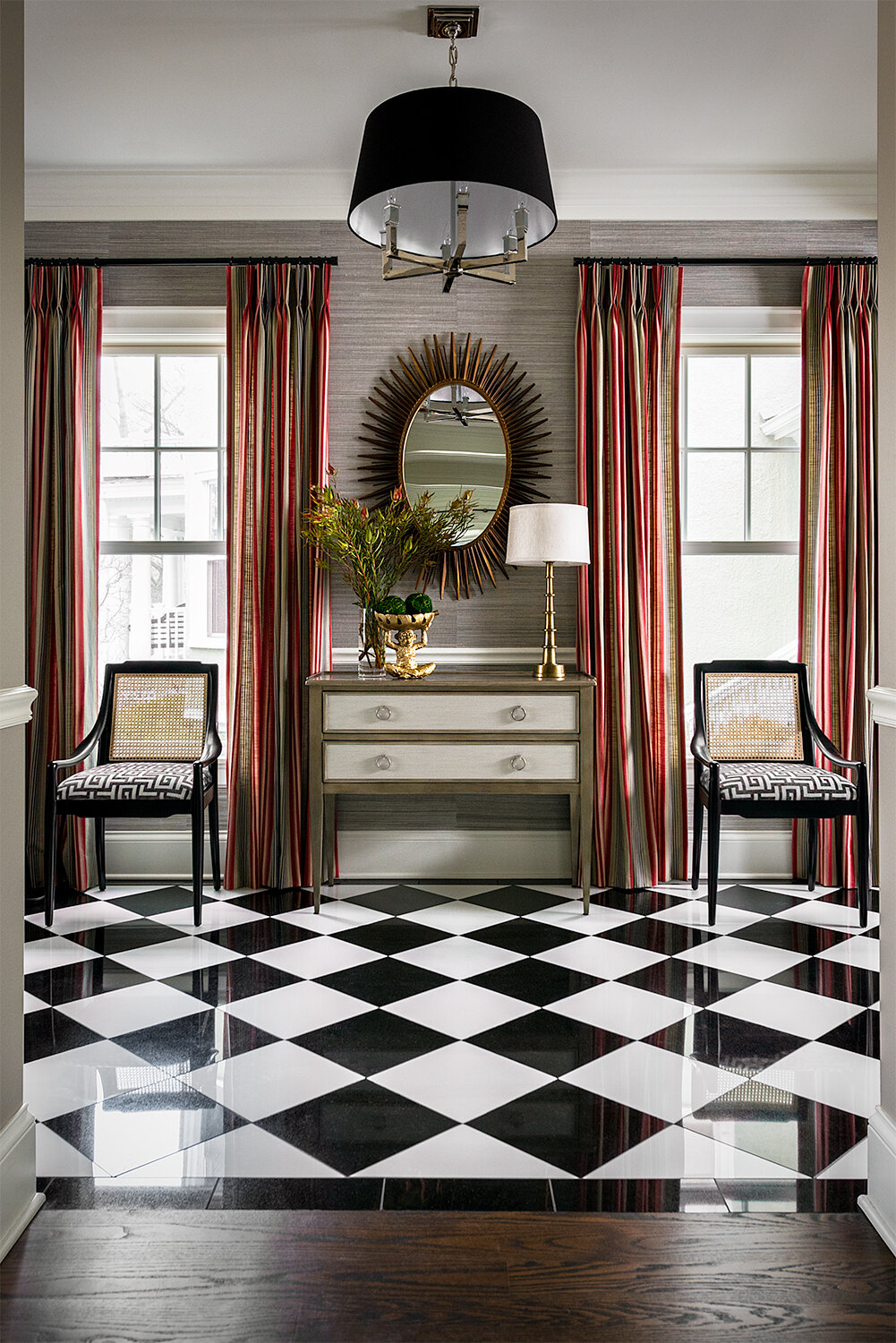
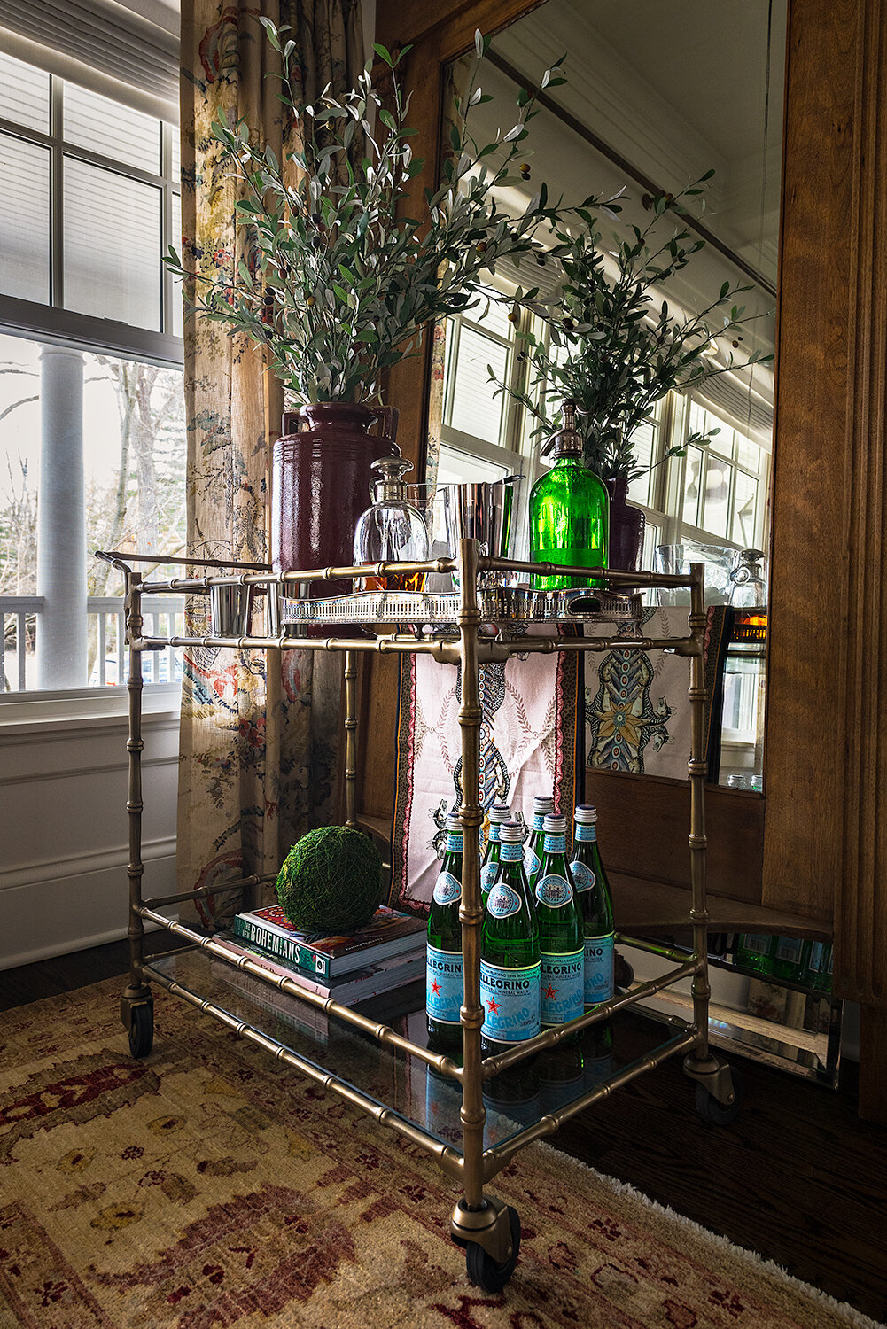
The format of my website really lends itself to horizontal compositions. As such, I generally don’t get to show vertical images unless I toss them up here on the blog. I used to mess around with pairing two verticals to show as a singular horizontal image, but the margins between images and the arranging and the out-of-format feel made the ocd tendencies I have (that make me pretty good at shooting interiors) go haywire, so I stopped that pairing nonsense a while back. That said, on a recent shoot for M. Lavender Interiors, we nailed a few verticals that I think are lovely and am therefore tossing them up on the aforementioned blog. Here they are!


